

Understanding What Really Makes WiFi Coverage Work

Ever wondered why your WiFi signal strength seems to have a mind of its own? It’s not just about the number of bars on your screen; there’s actual science at play. The way radio waves behave within your home or office is the real secret, explaining why taking just a few steps can mean the difference between a great connection and a frustrating one.
Getting to know these underlying principles can help you figure out what's truly affecting your WiFi's reach. This knowledge shifts your efforts to map wifi coverage from simple guesswork to a more informed, effective process.
The Journey of a WiFi Signal: Propagation Explained
At its heart, WiFi sends data through the air using radio waves, which are a type of electromagnetic energy. Imagine dropping a pebble into a calm pond – signal propagation is like those ripples spreading out, but in three dimensions and through all sorts of materials, not just water.
As these waves get farther from your router, they naturally lose energy and become weaker. This weakening is called attenuation, and it's a big reason why devices far from the router often have slower speeds or lose connection. These signals don't just travel in straight lines; they can bounce off, bend around, or get soaked up by objects, making it important to consider your whole environment when you map wifi coverage.
Unpacking the Influencers: What Affects Your Signal Strength?
A few key things determine how well your WiFi signal performs, affecting everything from its speed to how dependable it is. Learning about these factors can make a real difference in how you map wifi coverage for the best results.
-
Frequency Bands Matter: WiFi generally uses two main frequency bands: 2.4 GHz and 5 GHz.
- The 2.4 GHz band reaches farther and is better at going through solid objects. However, it’s more prone to interference from other common household gadgets and can be more crowded, sometimes resulting in slower performance.
- The 5 GHz band offers faster data speeds and usually faces less interference because it has more channels available. The trade-off is a shorter range and it doesn’t penetrate walls and floors as effectively. The band your devices use, or how they switch between them, will directly shape the coverage patterns you experience.
-
The Obstacle Course: Physical Barriers: The materials in your building are a big deal for WiFi signals.
- Dense materials such as concrete, brick, and metal are well-known for blocking signals.
- Things like plaster and drywall are less of a barrier but still absorb some of the signal.
- Even water, like in fish tanks or even a group of people, can absorb radio waves. Large metal items, like refrigerators or microwaves, can also cast significant "shadows" where the signal strength drops off.
-
The Unseen Noise: Interference: It's not just physical stuff that gets in the way; other electronic devices can mess with your WiFi signal.
- Common sources include microwave ovens (especially older ones that also use the 2.4 GHz frequency), Bluetooth devices, cordless phones, and even your neighbors' WiFi networks.
- This interference is like background noise, making it tougher for your devices to clearly "hear" the WiFi signal, even if the signal itself seems strong. This "noise" is a very important piece of the puzzle when you try to map wifi coverage.
Why Your Signal Plays Hide and Seek
That up-and-down WiFi strength you notice, even when you haven’t moved far? That’s often because of something called multipath interference. When radio waves bounce off walls, furniture, and other items, several versions of the same signal can reach your device at slightly different moments.
These reflected signals can either boost the original signal (constructive interference) or weaken it (destructive interference). This can lead to surprising dead spots or, conversely, areas with unusually strong reception. This is why a quick check of your WiFi in one spot isn't enough; you need a more complete picture to truly map wifi coverage and understand these shifting interactions.
The need for reliable WiFi is clear when you look at market trends. The global Wi-Fi market is growing fast, thanks to new technology and a greater need for wireless connections. It was valued at $22.06 billion in 2024 and is expected to hit $45.12 billion by 2029, growing at a compound annual growth rate (CAGR) of 15.4%. You can explore this topic further by looking into Wi-Fi industry research reports.
This expansion shows why everyone, from individuals at home to large businesses, benefits from a better grasp of their wireless setups. This understanding is especially important in places where getting a solid connection can be tough. For instance, you might find this interesting: Rural High-Speed Internet: Bridging The Digital Divide.
Choosing Tools That Actually Deliver Results

Once you have a good handle on how WiFi signals work, the next big step is picking the right instruments to visually map WiFi coverage. It's not just about downloading any app you find; choosing tools that give you genuinely accurate data is crucial for effective network analysis and improvement. This holds true whether you're tweaking a home office setup or managing a large corporate campus.
Differentiating Professional and Consumer-Grade Tools
The market is full of tools designed to map WiFi coverage. These range from extensive enterprise-grade solutions, like Ekahau AI Pro, which can cost thousands of dollars, to surprisingly effective mobile applications that fit a smaller budget. For example, IT professionals often depend on tools that provide deep analytics and reporting, which would likely be excessive for a homeowner just trying to find a few signal dead spots.
The main takeaway is that the "best" tool really depends on your specific needs and the complexity of the area you're analyzing. Make sure to focus on solutions known for precise measurements; a fancy user interface doesn't help if the data underneath is incorrect. In the end, you need a tool that helps you truly understand your WiFi environment, not just one that looks impressive.
Key Features to Look For in WiFi Mapping Software
When you're sifting through options to map WiFi coverage, several core features are vital for gathering useful insights. These functions help turn raw signal data into information you can act upon.
- Signal Strength Measurement (RSSI): This is the cornerstone of any WiFi survey. It shows the received signal strength in decibels-milliwatts (dBm). Consistent and accurate RSSI readings are essential.
- Heatmap Generation: Tools should be capable of creating visual displays of signal strength, signal-to-noise ratio (SNR), and other metrics laid over a floor plan. These WiFi heatmaps are indispensable for quickly spotting problem areas.
- Interference Detection: The capability to identify and sometimes locate sources of non-WiFi interference (such as microwave ovens or Bluetooth devices) can be extremely valuable. Some advanced tools can even classify these interference sources.
- Throughput Testing: Beyond just signal strength, knowing the actual data speeds possible in different areas gives a more thorough understanding of the user experience.
- Reporting Capabilities: For professionals, being able to generate detailed reports is key for documenting findings and making recommendations. Even for home users, a simple summary can be quite helpful.
- Floor Plan Integration: Accurate mapping depends on importing or creating a floor plan to overlay survey data. This spatial context is fundamental to understanding coverage patterns.
Hardware and Calibration: Ensuring Reliable Data
The software you pick is only one part of the picture; the hardware used for surveying and proper calibration techniques are just as important for reliable results. Some professional software, for instance, might recommend or even require specific WiFi adapters to ensure measurements are consistent and accurate.
Calibration is the process of making sure your measurements are as precise as possible. This might involve walking a designated path at a steady speed or taking multiple readings in the same spot to average out any variations. Without careful calibration, even the most expensive software can generate misleading heatmaps. This makes it hard to accurately map WiFi coverage and make well-informed decisions. Investing time to understand your tool's calibration process will definitely pay off in the quality of your data.
Here's a look at some popular WiFi mapping tools to help you understand your options. The following table offers a detailed comparison of popular WiFi mapping software including features, pricing, and best use cases.
WiFi Coverage Mapping Tools Comparison
| Tool Name | Price Range | Key Features | Best For | Platform |
|---|---|---|---|---|
| Ekahau AI Pro | $$$$ (Thousands) | AI-assisted design, advanced analysis, spectrum analysis, 3D modeling, reporting | Enterprise, Large/Complex Networks | Windows, macOS |
| NetSpot | Free - $$ (Hundreds) | Heatmaps, active/passive surveys, basic interference, reporting | Home Users, SMBs, Prosumers | Windows, macOS, Android, iOS |
| Acrylic Wi-Fi Home | Free - $ (Tens) | Signal strength, channel analysis, device inventory | Home Users, Basic Troubleshooting | Windows |
| WiFi Analyzer (Mobile Apps) | Free - $ | Basic signal strength, channel graphs, identify nearby networks | Quick Checks, Simple Home Use | Android, iOS |
Choosing the right tool means balancing features, accuracy, how easy it is to use, and your budget. The aim is to pick software and hardware that give you the insights needed to effectively map WiFi coverage and, ultimately, improve your wireless network's performance.
Your Step-By-Step Coverage Mapping Blueprint
So, you've got your tools ready, and it's time to get down to business: systematically mapping your WiFi coverage. This isn't just about wandering around with a device hoping for the best. It’s a structured approach, much like the pros use, to collect precise data and really understand how your network is performing. Let's walk through how to create a top-notch assessment.
Preparing for Your WiFi Survey
Before you even think about taking your first measurement, getting properly prepared is crucial. At the heart of any solid WiFi survey is an accurate floor plan.
- Get Your Hands on Detailed Floor Plans: If you can find architectural drawings, great! If not, sketch out the space yourself. Be sure to include major walls, doors, and any big items that might block signals. The more detail you capture, the closer your final map will be to the real situation.
- Pinpoint Important Spots and Known Trouble Areas: Consider where WiFi is absolutely essential and any spots where people have mentioned having problems. These locations will need a closer look during your survey.
Once you have your floor plan, it's time to think about your measurement strategy. You'll need to decide on the exact spots or routes where you'll gather data. This planning helps make sure your analysis is thorough when you map WiFi coverage.
Conducting the Survey: Capturing Real Usage Patterns
Now for the actual survey: this is where you move through the area and gather that important signal data. To really map WiFi coverage effectively, keep these points in mind:
- Move Systematically: Stick to planned paths or a grid pattern that covers the whole space. Don't just wander randomly, as you might miss those annoying dead zones or spots with interference. Imagine you're mowing a lawn – you want to cover every inch methodically.
- Keep Your Measurement Timing Consistent: Figure out how often you’ll take readings. Taking them more frequently (say, every few seconds or steps) gives you more detailed data but will take more time. Spacing them out more is faster but you could miss small areas with bad coverage. It's all about finding a good balance between speed and detail.
The infographic below breaks down the main steps: checking out the floor plan, taking those signal strength measurements, and then creating a coverage heatmap.
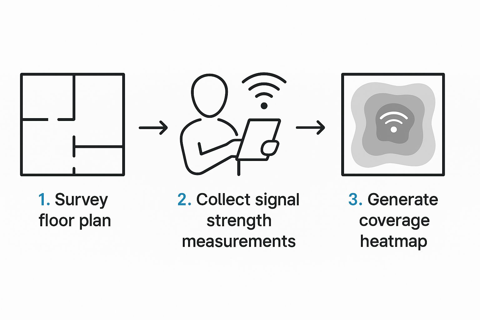 Seeing it laid out like this really shows how a structured process turns raw numbers into a clear picture of your WiFi performance.
Handling Complex Environments
It's one thing to map WiFi in a straightforward, open area, but many places come with their own set of challenges. Take multi-story buildings, for example; you'll need to survey each floor individually and think about how signals might pass between them. Buildings with unusual designs, like big open atriums or those with super thick walls (often found in older constructions or industrial spots), need extra care to understand how WiFi signals travel.
We're all using wireless more and more, which really shows why good mapping is so important everywhere. Wi-Fi coverage isn't just a convenience; it’s a big deal globally and has serious economic weight. For example, in Singapore, Wi-Fi's economic value was pegged at $10.6 billion in 2021 and is projected to hit $12.4 billion by 2025. You can find out more about the global economic impact of Wi-Fi. Numbers like these make it clear that solid WiFi coverage is essential, not just a nice-to-have.
Analyzing and Visualizing Your Findings
After you’ve collected all your measurements, the next big step is processing this information to really map WiFi coverage in a useful way. This usually means using special software that can generate visual heatmaps and help you spot patterns in the data. Although we're talking about WiFi here, it’s interesting to note that the wider world of environmental mapping uses some pretty advanced visualization tools. For instance, surveyors in other fields might use specific drone mapping software to build detailed models of sites. Ultimately, you want to turn all those numbers into an easy-to-understand visual report on your network’s condition.
Reading Heat Maps Like a Network Professional
After you've finished your WiFi survey, you'll get WiFi heatmaps – colorful charts that tell a vivid story about how your network is doing. These aren't just eye-catching visuals; they're loaded with information that, if you know how to read it, can show you exactly where to make your network better. Getting a handle on these maps is fundamental to successfully map WiFi coverage and fix any connection headaches.
Decoding The Colors And Patterns
The first thing you'll notice on a heat map is its color palette. Generally, this is what the colors mean:
- Green and blue tones point to strong signal and solid coverage.
- Yellow and orange suggest that signal levels are just okay or on the edge.
- Red often flags weak signals or areas where there's no connection at all, sometimes called dead zones.
But don't stop at the colors; look for patterns too. You'll frequently see circles spreading out from your Access Points (APs), with the signal getting weaker the further you are from the AP. If you see abrupt shifts in color, that could mean something physical, like a thick wall, is blocking the signal. Patchy or uneven colors might be a sign of interference, and spotting these visual clues is your first step to figuring out problems when you map WiFi coverage.
Key Metrics To Interpret
To really get what your heat map is saying, you need to zero in on some key numbers. These figures give you the hard data that backs up all those colors.
Here are the main ones:
- Received Signal Strength Indicator (RSSI): This is measured in decibels-milliwatts (dBm). Think of RSSI as how clearly your device can "hear" the signal from an AP. Numbers closer to 0 dBm are what you want (for instance, -50 dBm is much better than -80 dBm). If an area consistently shows low RSSI, you've likely got a basic coverage shortfall.
- Signal-to-Noise Ratio (SNR): Measured in decibels (dB), SNR stacks up your WiFi signal strength against any background noise. A higher SNR translates to a cleaner, more dependable signal. You could have a strong RSSI, but if the SNR is low (perhaps due to interference from a microwave oven), your WiFi performance can still suffer badly.
- Throughput Measurements: While RSSI and SNR tell you about signal quality, throughput is all about the actual data speeds people are getting. This is often the truest indicator of what users are experiencing. Low throughput even with good RSSI and SNR could point to problems like old APs or a crowded network.
This table gives you a general idea of how to read these values:
| Metric | Poor | Fair | Good | Excellent |
|---|---|---|---|---|
| RSSI | < -80 dBm | -80 to -70 dBm | -70 to -60 dBm | > -60 dBm |
| SNR (Signal-to-Noise Ratio) | < 10 dB | 10-20 dB | 20-25 dB | > 25 dB |
Looking at these metrics together, in the context of your specific environment, is crucial to correctly map WiFi coverage and grasp your network's performance.
Distinguishing Coverage From Capacity Issues
One frequent puzzle is figuring out if you have coverage issues (meaning, not enough signal reach) or capacity problems (where there's too much demand or interference for the signal you have). For example, if your heat map looks great with strong RSSI and SNR everywhere, but people are still complaining about slow WiFi, you might be looking at a capacity issue. This could mean too many devices are trying to use one AP, or there's a lot of co-channel interference.
On the other hand, if your heat map has obvious red zones (low RSSI/SNR) right where people need to connect, then it's probably a coverage problem. Knowing this difference helps you avoid wasting effort, like putting in more APs in a spot that actually has good coverage but is bogged down by interference. The need for dependable internet is widespread; as of February 2025, over 5.56 billion individuals were online across the globe, representing about 67.9% of everyone on the planet. You can discover more insights about global digital population trends on Statista.
Prioritizing Improvements Based On Impact
Once you've got a good read on your heat map, you're ready to make smart choices about improvements. It's best to start with the areas most important for your daily operations or where users are complaining the most. If you're seeing several problems, deal with the low RSSI/SNR zones first – maybe by moving an AP or adding a new one.
If you find spots with strong signal but lousy throughput, it's time to look for interference or see if your APs are overloaded. The main takeaway here is that analyzing your heat map lets you stop guessing and start putting in place specific fixes that will make the biggest difference to your network's performance.
Tackling Complex Environments and Special Challenges

Getting WiFi up and running smoothly in the real world isn't always straightforward. Many locations throw unique curveballs that need more than basic know-how to map wifi coverage effectively, stretching standard methods pretty thin. This is where professional-level analysis really proves its worth, especially when things get tough.
Dense Urban Environments and Heavy Interference
Big cities are often a nightmare for WiFi. With so many buildings, signals can bounce around, get scattered, or absorbed in ways you wouldn't expect. Plus, all those competing wireless networks create a massive amount of interference, making it a real challenge to find a clear channel. Setting up dependable WiFi in these spots can feel like trying to whisper in a crowded arena.
To handle this, careful multi-frequency analysis is key. Looking at both the 2.4 GHz and 5 GHz bands at the same time helps spot channels that aren't as busy. It also gives a better picture of how different frequencies travel through all that urban development, which is vital when you need to map wifi coverage in packed areas.
Outdoor and Large-Scale Deployments
Covering large outdoor spaces with WiFi, like university grounds, big event locations, or even widespread rural areas, comes with its own share of problems. Signal weakening over long distances is a major issue, along with the effects of different landscapes and changing weather. Trees and plants, for example, can soak up WiFi signals quite a bit, and how dense they are can vary with the seasons. You might find this interesting: 8 Rural WiFi Options for 2025: Fast, Reliable Internet.
Handling these setups usually means using special tools that can measure signals over longer ranges. Software that considers the shape of the land is also helpful. Unlike inside, where walls and rooms are set, outdoor spaces need a more flexible plan to correctly map wifi coverage.
Industrial and Unique Propagation Scenarios
Industrial places like factories, warehouses, and hospitals add even more twists due to how they're built and how they operate. These settings require a very specific approach to ensure reliable wireless communication.
- Factories and Warehouses: These spots often have big machines, lots of metal structures, and tall shelves. These things don't just block signals; they can also create a lot of electromagnetic interference (EMI). Add in moving vehicles and inventory that’s always shifting, and radio frequency (RF) behavior gets even trickier.
- Hospitals: These locations are packed with specialized electronic medical gear, and much of it can also give off EMI. Having a steady connection is absolutely essential for patient care systems, where losing a signal just isn't acceptable.
In these kinds of places, you need special tactics. This often means using tools like spectrum analyzers to find sources of interference that aren't from WiFi. Deploying tough access points built for rough environments is also common. Planning with predictive models before setting things up, and then doing surveys again after installation, is crucial to make sure coverage is solid where typical methods might not be enough.
Temporal Variations and Mission-Critical Validation
WiFi coverage isn't a fixed thing; it can change a lot during the day. These temporal variations happen because of shifts in how much the network is being used, people moving around (who can absorb RF signals), or different activities in a building. For instance, a school's WiFi usage will be highest when classes are in session, while an office might see more 2.4 GHz interference around lunchtime due to microwave ovens.
When it comes to mission-critical applications – think hospitals, emergency services, or factory control systems – network dependability is non-negotiable. Checking coverage in these situations means more than just looking at signal strength. It means testing for delays (latency), variations in delay (jitter), and steady data flow (throughput) under real-world usage conditions. When you map wifi coverage for these vital operations, the main aim is to ensure everything runs smoothly and safely, because network performance has a direct effect on results.
Turning Analysis Into Network Improvements
Spotting challenges within complex WiFi environments is a crucial first step. However, the real benefit of any project to map wifi coverage comes to life when that analysis leads to actual, noticeable improvements in your network. Just knowing where your dead zones are or which channels are overly crowded isn't the end game; the aim is to use this information to make your wireless network perform significantly better for all its users.
From Data to Decisions
The detailed heatmaps and performance numbers gathered from your coverage mapping provide a solid foundation for taking action. Instead of relying on guesswork, you now possess specific data that pinpoints exactly where your network needs attention. This allows for a much more focused and effective approach to resolving Wi-Fi headaches.
For instance, if your effort to map wifi coverage uncovers substantial dead zones, the most direct solution usually involves the strategic Access Point (AP) placement. An AP might just need to be shifted a few feet to get around a major obstruction, or you might need to add a new AP to bring coverage to a previously unserved spot. The data from your survey will clearly indicate the best locations.
Your analysis might also bring AP power levels into focus. If transmit power is set too high, it can create unnecessary interference with nearby APs, which can drag down performance. On the other hand, if the power is too low, devices at the edge of a coverage area might struggle with weak signals. Tweaking these levels, based on your mapping data, can markedly enhance both the reach of your coverage and the overall stability of your network.
Channel configuration is another vital area where your coverage map insights prove extremely useful. Overlapping channels are a common culprit for Wi-Fi interference, leading to slower speeds and connections that drop out. Your map wifi coverage can visually highlight areas affected by co-channel interference or adjacent channel interference, helping you choose clearer, non-overlapping channels for your APs.
Prioritizing for Maximum Impact
When you've identified several issues, figuring out what to fix first is important, particularly if you're working with limited resources. It's wise to concentrate initially on changes that tackle the most pressing problems affecting the largest number of users or the most critical areas of your space. Making sure to document before-and-after performance metrics will clearly show the positive effects of your changes.
To help organize this, the table below outlines typical WiFi coverage problems found through mapping and the optimization strategies to address them.
Common Coverage Issues and Solutions Overview of typical WiFi coverage problems identified through mapping and corresponding optimization strategies
| Coverage Issue | Symptoms | Root Causes | Recommended Solutions | Expected Improvement |
|---|---|---|---|---|
| Dead Zones | No signal, frequent disconnects | Physical obstructions, AP too far, insufficient APs | Relocate/add APs, use mesh system/extenders | Consistent connectivity |
| Channel Interference | Slow speeds, intermittent drops despite good signal strength | Overlapping channels (co-channel/adjacent) | Manual channel selection (e.g., 1, 6, 11 for 2.4GHz), reduce channel width | Increased throughput, stability |
| Low Signal-to-Noise Ratio (SNR) | Unreliable connection, poor performance even with "full bars" | RF interference (microwaves, Bluetooth), distant AP | Identify/remove interference source, shield AP, relocate AP | More stable, faster connection |
| Sticky Clients | Devices stay connected to distant AP despite closer options | Poor device roaming logic, AP transmit power too high | Lower AP transmit power, enable band steering/fast roaming | Improved roaming, better AP load balance |
| Low Throughput | Slow file transfers, video buffering despite good signal | Outdated APs, network congestion, severe interference | Upgrade APs, optimize channel/power, check backhaul connection | Faster actual data speeds |
Addressing these issues with focused solutions, as detailed in the table, can make a big difference in how people experience your network. Even in places where improving coverage seems particularly tough, a systematic, data-driven approach pays off. For those dealing with broader connectivity issues, especially in less connected locations, our article on How to Get Internet in Rural Areas: 5 Easy Tips might offer some useful ideas.
Ultimately, the journey to map wifi coverage and then act on those insights is all about delivering practical, positive changes. Whether you're fine-tuning an existing setup or planning a brand new deployment, the goal is to build a wireless network that dependably serves its users, cutting down on frustration and helping everyone be more productive.
Avoiding Costly Mistakes and Professional Best Practices
Getting your network analysis to translate into actual improvements often boils down to the quality of your initial work to map WiFi coverage. Picking up tips from experienced network professionals can help you steer clear of common slip-ups that could otherwise derail your whole assessment. When you adopt professional best practices, you ensure your mapping gives you dependable, actionable information for optimizing your network with confidence.
Timing Is Everything: When to Conduct Your Survey
One frequently missed detail in a successful WiFi survey is the timing. Network usage can swing wildly throughout the day or week. For example, an office network might hit its peak during business hours, whereas a home network could see the most traffic in the evenings and on weekends.
To get a true sense of performance, keep these points in mind:
- Survey during typical usage periods: To really understand how your network holds up under normal conditions, run at least one survey when activity is at its highest.
- Consider off-peak surveys: Doing another survey when things are quieter can help you set a performance baseline and spot issues that aren't just about network congestion.
This two-pronged approach makes sure your plan to map WiFi coverage gives you a full picture of network behavior, not just a single snapshot, leading to more dependable solutions.
Recognizing Environmental Influences During Your Survey
While physical barriers and RF interference clearly affect WiFi signals, the actual process of surveying requires sharp observation as you go. When you map WiFi coverage, make sure to actively note any environmental factors that might be affecting your measurements in the moment. This isn't just about noticing a concrete wall; it's about seeing temporary conditions like a suddenly packed meeting room or a new piece of equipment that wasn't there last time.
Also, think about the wider effects of network efficiency. Fine-tuning your WiFi for better coverage and performance can also lead to smarter energy use, especially with Access Point power settings. Improving network efficiency can be seen as a way to manage energy. For those interested in more ideas on this, you can explore these Energy Management Strategies. This kind of awareness helps in building a stronger, more adaptable network that works well in different situations.
Documentation: The Foundation of Long-Term Value
Keeping detailed documentation isn't just a boring admin chore; it’s a crucial step that provides lasting benefits for network planning and future troubleshooting. Without it, today's clear analysis can easily become tomorrow's forgotten information, forcing you to do the work all over again.
Your survey documentation should always include:
- Date and time for each survey path you walked.
- The specific tools and software versions you used, along with their exact configuration settings.
- Detailed floor plans that clearly show AP locations, survey paths, and important measurement spots.
- Notes on environmental conditions observed during the survey (like how many people were around, active machinery, or new potential interference sources).
- The saved heatmap files themselves, plus a brief summary of key findings and any problem areas you found.
This careful record-keeping is incredibly useful when you need to map WiFi coverage again or figure out new problems that crop up later.
Quality Assurance and Validation: Catching Errors Early
Making sure your collected data is accurate is vital for any good network assessment. Quality assurance (QA) practices are there to help you find errors before they lead to bad decisions and wasted time. Always start by making sure your survey equipment is properly calibrated as per the manufacturer's instructions, as this is the foundation for reliable readings.
Additionally, building validation methods into your workflow is key. After your main comprehensive survey, think about doing quick spot checks in important areas or zones that showed surprising results. For instance, if a small spot shows unusually bad coverage, a quick re-survey with slightly different settings or at another time can tell you if the reading was accurate or just a temporary blip. This careful checking prevents expensive mistakes based on potentially flawed initial data from your effort to map WiFi coverage.
Maintaining Mapping Accuracy Over Time
A WiFi setup rarely stays the same; it’s a living system that changes with how it's used and what’s around it. Changes to the physical layout, new electronic devices, or even firmware updates on your Access Points can significantly change your current coverage patterns. So, your first detailed effort to map WiFi coverage shouldn’t be seen as a one-off task, but as the beginning of an ongoing commitment.
Create a proactive plan for periodic re-mapping to keep an accurate understanding of how your network is performing. This is particularly important in these situations:
- After any big network changes, like adding or moving APs, or major updates to configurations.
- Following significant changes to the environment within the coverage area, such as an office redesign or installing new large machinery.
- On a regular basis, maybe annually, to proactively spot slow performance decline or identify new coverage gaps.
Maintaining mapping accuracy over time ensures your network keeps up with user needs effectively and supports smart, continuous optimization choices.
Tired of battling inconsistent WiFi in your rural home or on the road? SwiftNet Wifi delivers blazing-fast 5G internet, so you can stream, work, and connect without compromise, no matter where your adventures take you. Discover reliable high-speed internet today at SwiftNet Wifi!


